The Problem
Many cities in Los Angeles County have adopted public art programs to commission more art in public places. However, organizers currently rely on traditional and outdated methods of recruitment.
How might we empower artists and enable communities to facilitate local art projects?
"The Pope of Broadway" by Eloy Torrez (1985) | Photo: Gil Ortiz (MCLA), LAweekly
Research Methodologies
To solve the problem I used published data and research to learn more about the space. Then I looked for existing solutions and conducted a competitive analysis. I also conducted user interviews to learn directly from the target users. Finally after designing solutions I would test them with users and make any necessary changes.
I was the sole designer on this project and conducted research, developed ideas into designs, and tested them with real users.
Preliminary Research
Throughout my research I consistently read that public art is more then just beautification but also representation. In the published work Women Creating Public Art and Community the authors explain that “arts can play a unique role in challenging dominant cultural narratives, supporting empowerment, and fostering an inclusive and socially just communities.”
Mulvey, A., & Egan, I. M. . (2015). Women Creating Public Art and Community, 2000-2014. American Journal of Community Psychology, 55(1/2), 115–127.
I also learned that many cities and states run PFA (percent for art) programs where a percent of building projects’ budgets must be set aside for public art. My hometown Glendale has accumulated more than $6.8 million in funding through this program.
Competitive Analysis
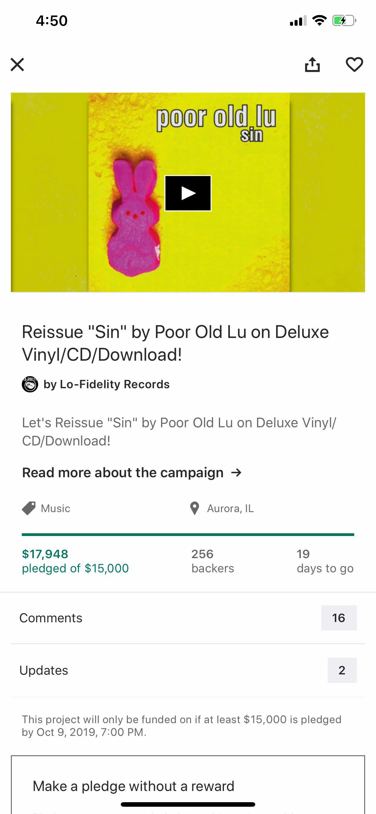
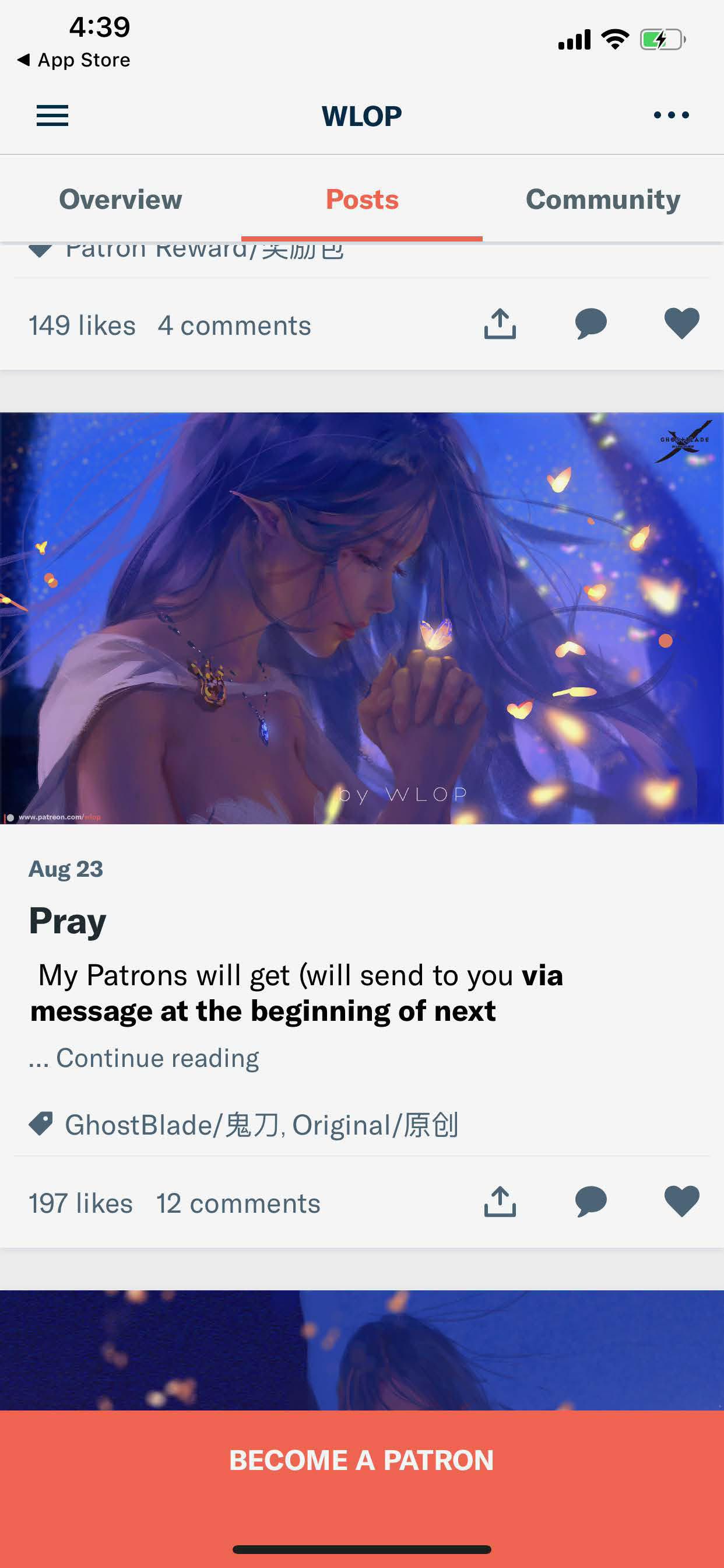
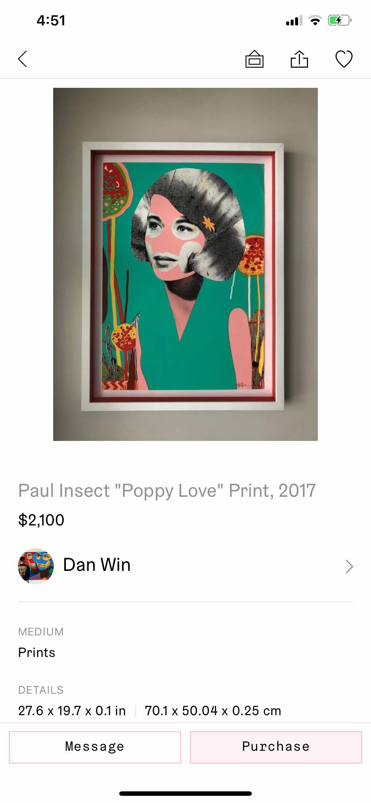
There is no app that is focused on the specific problem of commissioning and promoting murals in local neighborhoods. Therefore I have selected 3 apps that solve similar problems: Kickstarter, Patreon, and Artfare. Kickstarter allows users to crowd fund for startups and projects. Patreon allows creators to crowd fund from subscribed members for exclusive content. Artfare allows artists to sell their work as well as meet collectors.
Survey & Interviews
After conducting surveys and interviews of artists, city officials, and residents I learned that:
• Citizens appreciate and find great value in public art.
• Artists would love to work with the city and are always looking for more opportunities.
• City officials would prefer a convenient and streamlined approach to finding artists and getting community feedback about project
Artist Robert Vargas painting live in Downtown Los Angeles
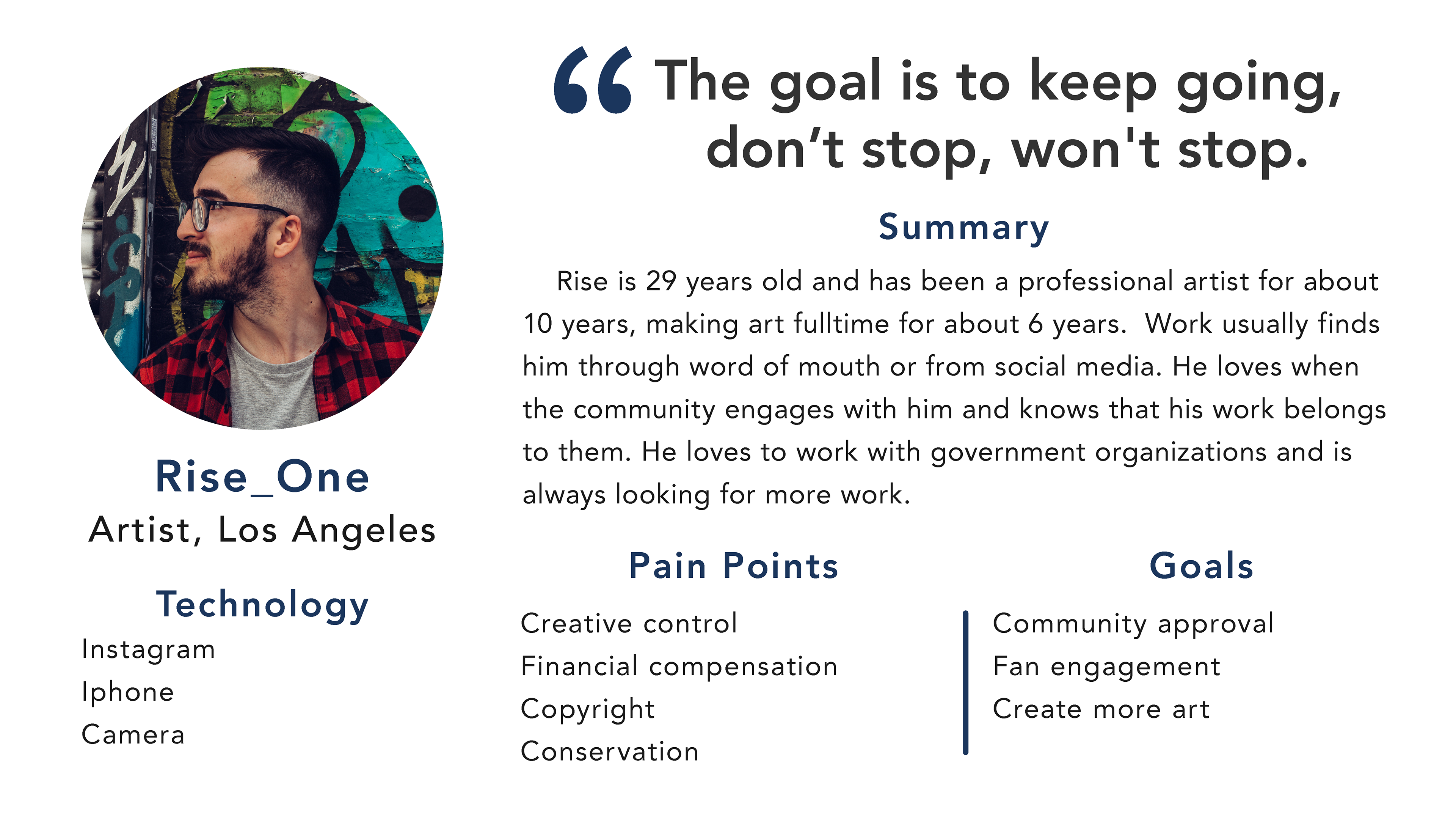
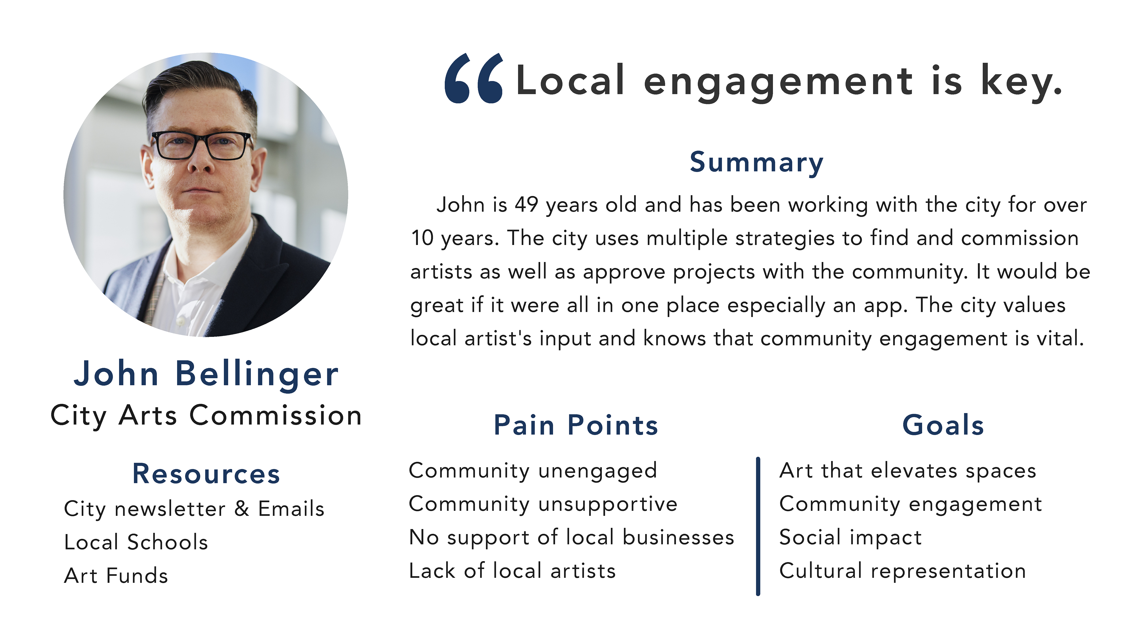
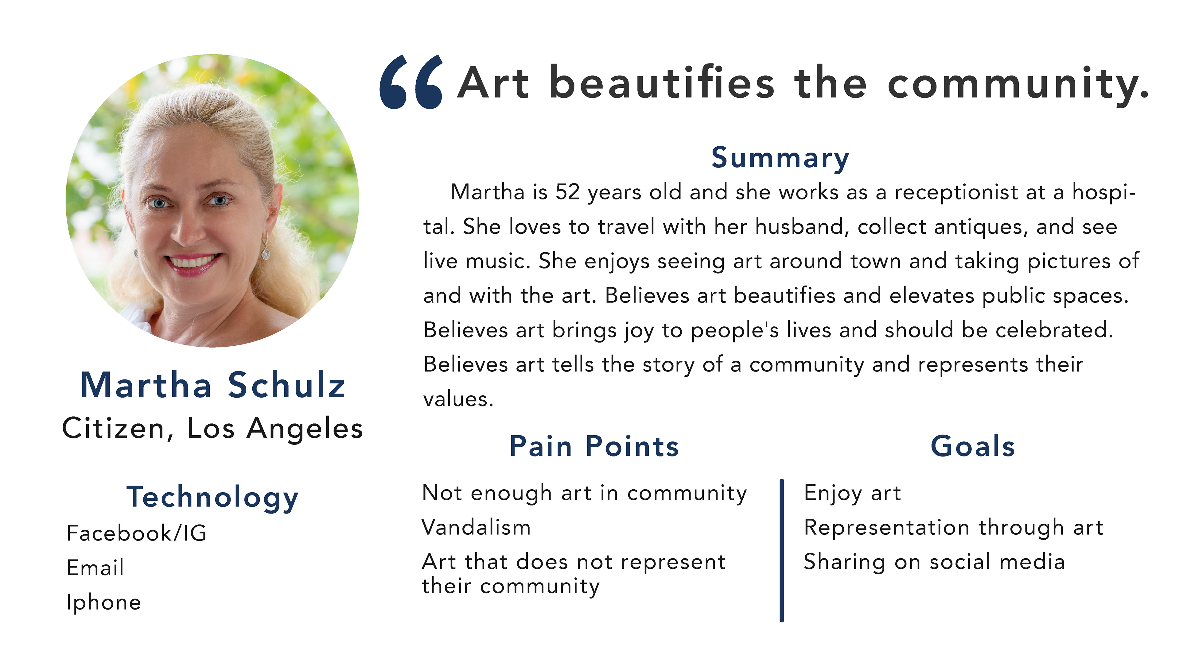
User Personas
Using what I learned from research and interviews I synthesized the information to create three distinct common user types. These will be used to understand users' needs, experiences, behaviors and goals.
User Stories
Taking the needs of users I was able to map the most the common paths users would take. Users want to engage with the community by posting content, find art with a map, apply for art opportunities, and facilitate the commission of new public art project.
Sketches
Using paper sketches I tested iterations of my designs and flows with users and learned that users were confused with navigation, labeling, and workflow. Users were confused by the low-fidelity paper prototypes so I concluded that a digital prototype would be a better gauge of users’ experience.
Wireframes
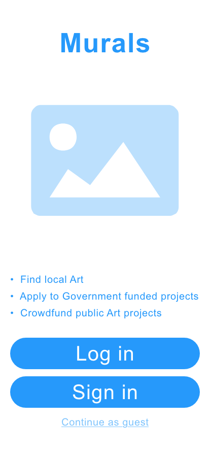
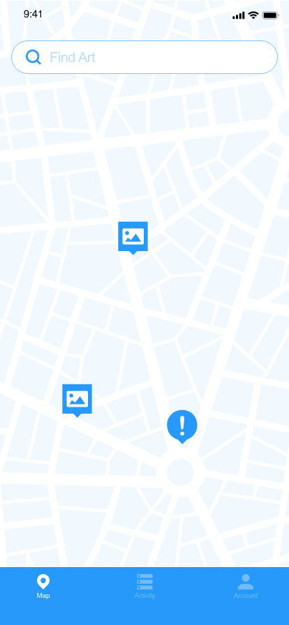
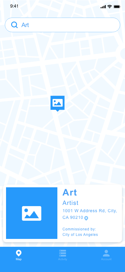
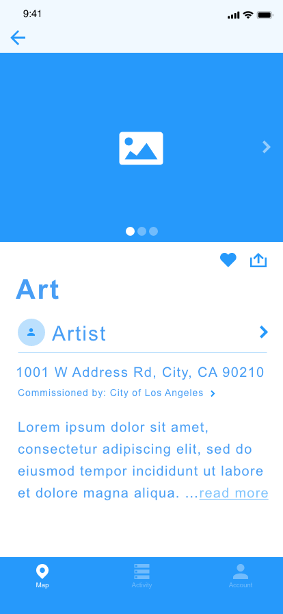
Learning from sketches I then made these mid-fidelity wireframes that illustrate some of the most important screens. This was were I could get a better idea about how things fit on the screen and the flow of the app.

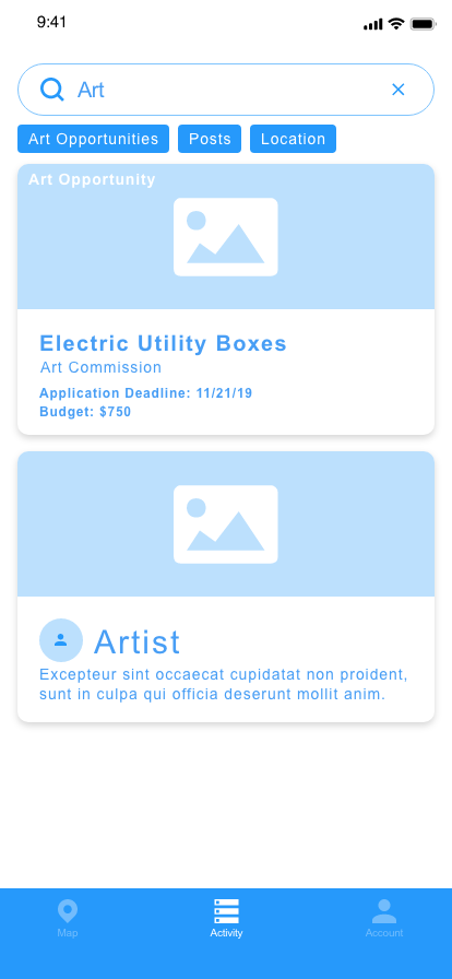

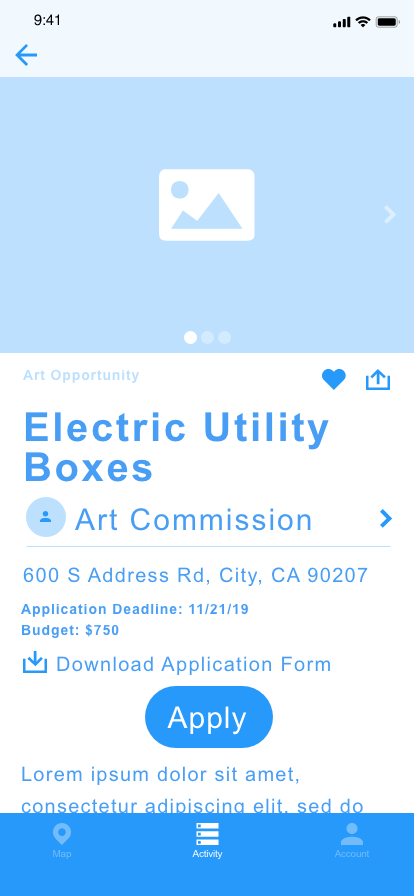

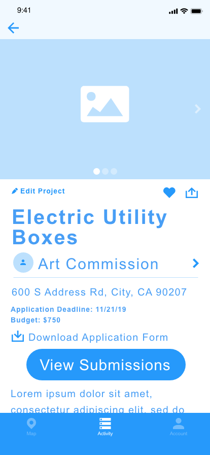

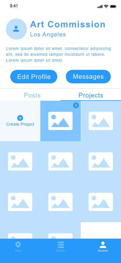
Usability Tests
Testing the prototype with users is a crucial step because it helps us understand any problems users might have when interacting with the product as well as how much they like the product. The goals of the tests were to get feedback on initial thoughts, usability issues, and technical issues. Users were asked about their initial impressions of screens as well as to perform common tasks. Here are some quotes:
“It’s fun to use, people will want to use it”
-Chuck Wilke, Glendale Arts Commission
“I wish this existed already so I can look for mural work wherever I go!”
-Craoe, Los Angeles Artist
“This is awesome for people to apply!”
-Virginia Causton-Keene, Burbank Arts Program
Style Guide
Because the product will focus on creative work, a clean and simple design will let the art speak for itself. I chose the color orange as the main branding color because it is associated with creativity and reflects the artistic nature of the app. The dark blue compliments the orange and is needed for better legibility than orange. I chose the font Essonnes for titles because it is ornate and detailed, which reflects the artistic nature of the app as well.
High-Fidelity Design
Finally, the high-fidelity prototype featuring the new style guide and changes from user testing. The interactive prototype was created in Adobe XD and tested using an iPhone X. Here are some screen shots and a live interactive prototype below.
Interactive Prototype
Next Steps
The next major feature I would add is an event calendar. This would satisfy the needs of public art programs that must make their agenda public. A calendar would also make it possible for art events, galleries, and museums to be promoted on the app. I would also add the option to make project submissions public with a voting and commenting feature for public projects.
Thank you for reading!
Please let me know if you have any questions?
Argishti Ghadimi
UX/UI Research & Design
